 |
| "Goldenrod" 10x8 acrylic |
Sunday, December 22, 2013
"Goldenrod"
Monday, December 16, 2013
"Old Gray Warrior"
 |
| "Old Gray Warrior" 11x14 acrylic |
I think this one is destined for the Southeastern Wildlife Exposition in Charleston, SC.
Tuesday, December 3, 2013
Get Something Started (WIP)

As the year is quickly drawing to a close, I've been itching to work on a large painting or two. Last week I went out to the garage and cut a 20x40 panel with this mule deer piece in mind. The image above shows the first layer of very thin paint. This underpainting will be almost completely cover with subsequent layers of thicker paint, but sets the tone for what the finished piece will eventually look like.
The remainder of the painting will be slow going, but I will try to post progress photos from time to time. Stay tuned.
Special thanks to my friend Ray Brown for providing reference photos for this painting.
Monday, November 25, 2013
"Rock Star"
 |
| "Rock Star" 12x20 acrylic |
I struggled for several months with this painting. I was happy with the rocks and ferns, but couldn't seem to nail the bird. So I tried several times with multiple bird species, never really happy with the results. Finally, after the magnolia warblers and white-throated sparrows were painted out, a black-capped chickadee took up residence and seemed right at home.
Sunday, November 3, 2013
"Quiet Water"
 |
| "Quiet Water" 9x6 acrylic |
Saturday, November 2, 2013
Waterfowl Festival 2013

I'm hoping to finish all my last minute painting and framing over the weekend. It's sure to be another fun show... especially if the weather is good like last year!
Monday, October 28, 2013
"October Orange"
 |
| "October Orange" 9x6 acrylic |
Thursday, October 24, 2013
Bison Sketches
The past few weeks have been filled with time spent drawing. Bison are such a cool subject for drawing. Their musculature makes for interesting shadow and highlight combinations.


Monday, October 21, 2013
Sketchbook Pages


Thursday, October 17, 2013
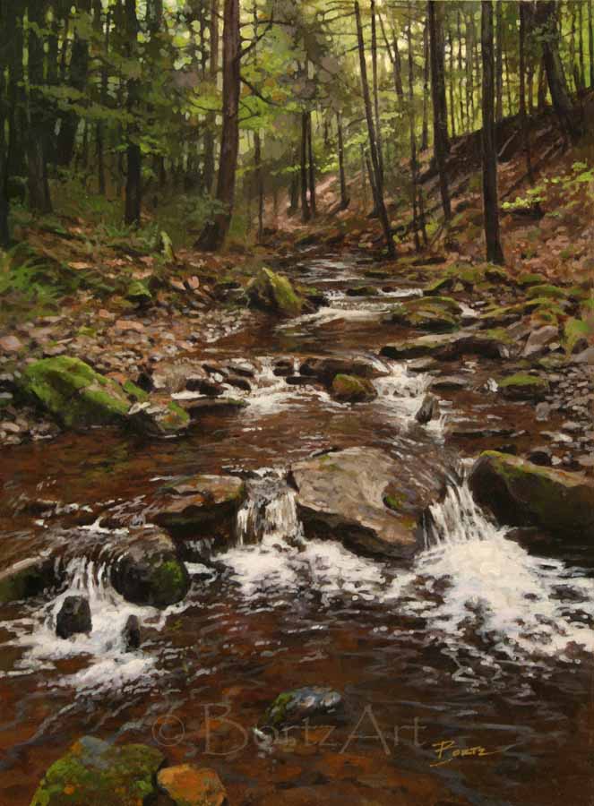
"Pocket Water"
 |
| "Pocket Water" 17.5x10 acrylic |
Saturday, October 12, 2013
Drawing.... AGAIN!!!!
"There is always time to draw, so stop making excuses and just do it!"
It seems I say that a lot these days. During the course of a 4-day show, I'll bet I get asked a dozen times by young artists what it would take for them to be a better painter. The answer is always straight forward and simple. DRAW!
But there are always excuses. "I don't like to draw." "I don't have time." "I only want to paint." Blah blah blah.
 Drawing is the one skill seemingly forgotten among many up-and-coming artists. With the incorporation of digital photography and powerful (and very useful!) programs like Photoshop, drawing skills seem to be largely ignored. Instead of using photography and Photoshop to complement a solid concept derived from a sound creative process, they are used as a crutch or a shortcut to bypass the necessary skills needed to produce good art. That is a huge and very noticeable mistake.
Most people look, but do not truly see what's in front of them. Their perception is based on what they think they know about an object, rather than actual observation. The ability to block out this preconceived noise and learning to actually see is the most important part of creating representational art. Nothing can teach a person how to see better than constant and repetitive drawing exercise.

So... my young artist friends... buy a sketchbook. Hell! Buy 4 or 5 cheap ones! And start filling the pages with what you see. It's always interesting to look at the pages of a full and tattered sketchbook and see the progress from the first page to the last. It is at that point you will learn the importance of drawing. It is always a productive and enjoyable way to pass the time.
 |
| Yesterday's field study |
But there are always excuses. "I don't like to draw." "I don't have time." "I only want to paint." Blah blah blah.
 Drawing is the one skill seemingly forgotten among many up-and-coming artists. With the incorporation of digital photography and powerful (and very useful!) programs like Photoshop, drawing skills seem to be largely ignored. Instead of using photography and Photoshop to complement a solid concept derived from a sound creative process, they are used as a crutch or a shortcut to bypass the necessary skills needed to produce good art. That is a huge and very noticeable mistake.
 |
| A quick gesture study from a photo on the internet |
Most people look, but do not truly see what's in front of them. Their perception is based on what they think they know about an object, rather than actual observation. The ability to block out this preconceived noise and learning to actually see is the most important part of creating representational art. Nothing can teach a person how to see better than constant and repetitive drawing exercise.

So... my young artist friends... buy a sketchbook. Hell! Buy 4 or 5 cheap ones! And start filling the pages with what you see. It's always interesting to look at the pages of a full and tattered sketchbook and see the progress from the first page to the last. It is at that point you will learn the importance of drawing. It is always a productive and enjoyable way to pass the time.
Thursday, October 3, 2013
"Prelude to Autumn"
Inspired by a recent day afield, this small painting came together rather nicely. I may need to explore the possibility of painting this motif in a larger format.
 |
| "Prelude to Autumn" 8x6 acrylic |
Tuesday, September 24, 2013
Plein Air Afternoon

 It's funny how quickly time passes while I paint outdoors. I try to work fast hoping to capture the essence of a scene before the light changes too drastically. Today, I finally noticed I was starting to get cold and the sun was dropping behind the trees to the west. I'd been there for nearly 2 hours at that point and wished I'd brought along the sweatshirt I left in the truck.
As you can see in this last photo, the light was significantly different than it was when I started the painting. Still, I managed to get it to where I could say "done".

Saturday, September 14, 2013
Problems to Solve
 I've been working on a piece titled "Rock Star"
for several months and I can't seem to finish it to my satisfaction. It has
been one of those paintings that came together very quickly, only to land with
a thud at the end. It's spent a large part of the past 6 months leaning against
the wall facing the corner... being punished like a rotten child!
I've been working on a piece titled "Rock Star"
for several months and I can't seem to finish it to my satisfaction. It has
been one of those paintings that came together very quickly, only to land with
a thud at the end. It's spent a large part of the past 6 months leaning against
the wall facing the corner... being punished like a rotten child!
The bird... the most important element... has been the
sticking point. I've painted in several, only to paint them back out as though
they had perched for a second and flown away. I have gone back and forth
between a white-throated sparrow and a magnolia warbler... working many poses
and gestures... but they feel stiff and lifeless to me. They don't yet feel
like they belong in the painting and it frustrates the hell out of me!
 So I am going back to the drawing. I may even change the
species of bird (again!). I'll keep working until something clicks. It's not so
bad. The challenge inspires me.
So I am going back to the drawing. I may even change the
species of bird (again!). I'll keep working until something clicks. It's not so
bad. The challenge inspires me.Thursday, August 29, 2013
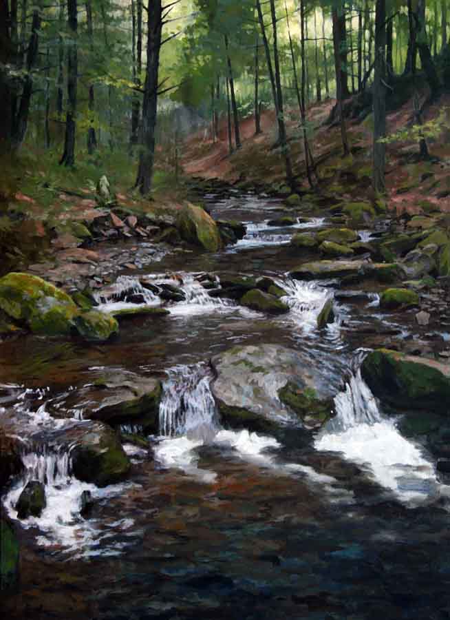
"Plunge Pool"
 |
| "Plunge Pool" 14x11 acrylic |
In this painting, "Plunge Pool", I've achieved a couple of things that, in the past, have largely eluded me. I've been doing some experiments trying to get the natural green tones in my work to be more lifelike. I hit on some mixtures that seem to work well in most situations. Surprisingly enough, there is not a drop of "out of the tube" green paint in this piece. It was all worked out with subtle shifts in mixtures of various yellows and blues.
More importantly, there is an impressionistic quality to this piece not really noticeable in my previous work. Not that I haven't tried. Up to this point, most of my efforts toward this effect have come up miserably short. I like painting with bigger brushes. I'm just not very good at it. Smearing and blending big blobs of paint to get a desired look without a bunch of tiny brush strokes intrigues me. I smile every time I pull it off.
 There are usually parts of a painting that are my favorites. This piece had several! I like the way the mossy boulders emerge from the background at the top of composition. It's out of character for me not to render a painting right out to the edges of the board. But here, the lack of detail in that area seems to work, allowing the viewers eye to take in the tumbling water without being distracted by unnecessary detail.
Is this a new direction for my art? Perhaps. I think there is a balance between "loose and painterly" and "photographic detail" that I'm constantly searching for. I may have found it with this painting. Now the challenge will be to do it again, prooving to myself this was no accident.
Thursday, August 22, 2013
"Flash - Rainbow Trout"


 |
| "Flash - Rainbow Trout" 15x15 acrylic |
Wednesday, August 21, 2013
Wood Duck Drake Study
I'm not a big fan of this type of motif... the profile "field guide" pose. It's been done thousands of times and I usually make it a point NOT to paint things like this. The pose itself is pretty boring and the bright over-the-shoulder lighting in the reference photo wasn't really adding much. There are however, some redeeming qualities to this image that made it worth taking on.
I was immediately drawn to the iridescent feathers on this wood duck's head. I knew it would be a challenge to get this to look "right" and would likely make or break the painting. The subtle transitions between blues, greens, purples, and blacks also give the head some volume and hopefully keep the painting from looking flat.
There were a few issues with the head and neck in the photo I was working from... mostly the outstretched neck with the head upright and alert. This is a problem with a lot of reference photos (especially of waterfowl). Our mere presence is enough to put the birds on edge and they always seem ready to flee. I wanted the duck to appear more relaxed, so I tucked the head down and back a bit, all but eliminating the neck.
The biggest challenge and the main reason I didn't dismiss this image as a potential painting was the patterns reflected on the water around the bird. I knew if I was successful, the water would be a subtle, yet powerful element to the painting few people would notice. If I was not successful, it would be a glaring miscue and EVERYONE would notice.
 |
| "Woodie" 6x8 acrylic |
I was immediately drawn to the iridescent feathers on this wood duck's head. I knew it would be a challenge to get this to look "right" and would likely make or break the painting. The subtle transitions between blues, greens, purples, and blacks also give the head some volume and hopefully keep the painting from looking flat.
There were a few issues with the head and neck in the photo I was working from... mostly the outstretched neck with the head upright and alert. This is a problem with a lot of reference photos (especially of waterfowl). Our mere presence is enough to put the birds on edge and they always seem ready to flee. I wanted the duck to appear more relaxed, so I tucked the head down and back a bit, all but eliminating the neck.
The biggest challenge and the main reason I didn't dismiss this image as a potential painting was the patterns reflected on the water around the bird. I knew if I was successful, the water would be a subtle, yet powerful element to the painting few people would notice. If I was not successful, it would be a glaring miscue and EVERYONE would notice.
"Cloudburst"
 |
| "Cloudburst" 11x14 acrylic |
I'm always experimenting with different styles of painting. This one took a while to put together, but I'm happy with the results. I wanted to work with mostly larger brushes and blend the paint on the canvas (not always an easy task with acrylics). I learned a lot while working on this piece and it should help me moving forward with my art.
Saturday, August 3, 2013
"Passing Through"
 |
| "Passing Through" 8x6 acrylic |
Friday, July 12, 2013

Friday, July 5, 2013
"Rock Bottom"
 |
| "Rock Bottom" 5x7 acrylic |
I love these little trout studies. I think I need to go fishing to get more reference material! :)
Tuesday, July 2, 2013
"Harbor Sunset"
 |
| Quick block-in |
From my days of fishing the Buffalo Harbor area many years ago, this study depicts a November sunset over Lake Erie. It is the first of hopefully many more studies aimed at pushing my art to the next level.
 |
| "Harbor Sunset" 4x6 acrylic |
Saturday, June 29, 2013
Steady Progress
 |
| "Stone Wash" 9x12 study |
 |
| 22x16 block in |
I've included images of the block-in stage of the painting as well as the first stage of refinement. At this point, I will probably set the painting aside for a week or two and come back for finishing refinement with fresh eyes.
I hesitate to move onto another project when this one is going so well, but I always paint better if I let it sit for a while.
While the larger painting will be similar to the study, there will be some distinct differences. The pool at the bottom of the painting will hopefully appear much deeper than in the study and some of the foreground rocks will be eliminated.
 |
| First refinement |
Saturday, June 1, 2013

Thursday, May 16, 2013
"Middle America"
 |
| "Middle America" 5x10 acrylic |
Tuesday, May 14, 2013
The Bounty of Spring

Like a lot of outdoor types, I like to occasionally harvest
a bit of the seasonal bounty the land (and water) has to offer... especially if
it means a chance to cook an outstanding meal! I'm always on the lookout for
morels the first couple of weeks of May. Most times they're not easy to find,
but very much worth the effort. Last night the morels were coupled with freshly
caught rainbow trout, both sautéed in a bit of olive oil with a dash of lemon
on the fish. A couple of ice-cold beers were also required... one while cooking
and the other while eating. It was terrific!
Thursday, May 9, 2013
Another Birds In Art Flight Begins!

My recent painting "Five Below" has been accepted into the 2013 Birds In Art exhibit! What an outstanding start to the day!!! I can't wait to get back to Wausau in September to catch up with all my BIA friends. Woo hoo!
Wednesday, May 8, 2013

Tuesday, April 30, 2013
"Apparition"
 |
| "Apparition" 12x9 acrylic |
I haven't been having much luck getting any projects finished lately. I have 7 paintings in various stages of incompletion. It felt good to sign and photograph this one today.
Wednesday, April 24, 2013
April at Its Finest
I left the studio yesterday morning at 9:00 setting off to explore a small trout stream I had not fished since I was a youngster. My calls to fishing partners the day before were unsuccessful, so I was on my own... and that was okay. The solitude would offer me the luxury of moving at my own pace, poking along the stream banks and lingering as the mood dictated.
 Soon after I left the truck, the morning sun had warmed the countryside enough to make my fleece jacket unnecessary. I stuffed it into my daypack and started looking for trout.
It's funny how I can get distracted from the task at hand on days like this. Wildflowers carpeted the brushy stream banks and I found myself spending quite a bit of time photographing them. Trout lilies, spring beauty, and large toothwort (I think) were thriving in the rich soil of the valley floor. I happily crawled along the wet muddy ground shooting photo after photo.
With that out of the way, I got back to trout fishing. There were clouds of caddis flies hovering above the water. The streamside brush was covered with them. It wasn't long before I caught my first fish... a large fat brook trout that made me smile as I popped the hook from its jaw and let it swim away. That was a very good start!
The trout, mostly rainbows, were finicky. I fished long stretches of spectacular water without a sign of a fish, then happen upon a spot where I'd catch one and maybe miss another. The lengthy distances between fish contacts were puzzling. I don't feel like I ever really figured the fish out, so every time I managed to hook one, it seemed like I accomplished something.
The wildlife activity along the stream made me think the critters were enjoying the warm sun as much as me. Deer would wander up to me as I stood in the middle of the stream before realizing I was there. Turkeys scurried through the skunk cabbage. Ruffed grouse flushed ahead of me offering only a glimpse as they winged through the dense undergrowth. At one point, a sharp-shinned hawk nearly took my hat off as it zipped by.
This morning, my sore legs are a reminder of a great day afield. I can get back to my work in the studio with a renewed enthusiasm. Time to get busy!
 Soon after I left the truck, the morning sun had warmed the countryside enough to make my fleece jacket unnecessary. I stuffed it into my daypack and started looking for trout.
It's funny how I can get distracted from the task at hand on days like this. Wildflowers carpeted the brushy stream banks and I found myself spending quite a bit of time photographing them. Trout lilies, spring beauty, and large toothwort (I think) were thriving in the rich soil of the valley floor. I happily crawled along the wet muddy ground shooting photo after photo.
 |
| Trout lily |
 |
| Large toothwort |
 |
| Caddis flies along the stream |
 |
| Rainbow trout |
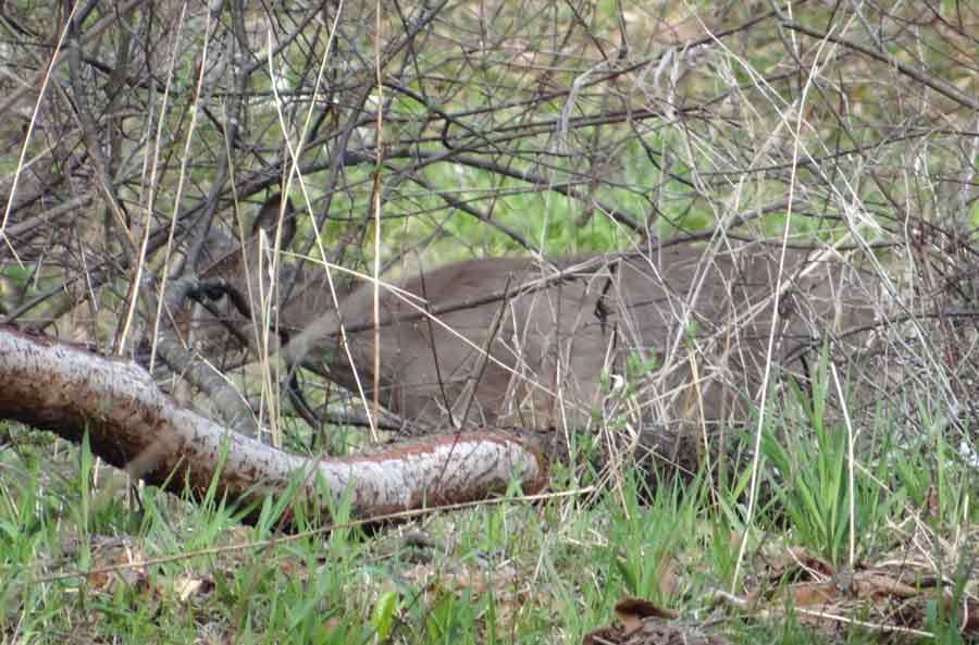 |
| One of many deer along the stream |
This morning, my sore legs are a reminder of a great day afield. I can get back to my work in the studio with a renewed enthusiasm. Time to get busy!
Subscribe to:
Posts (Atom)