I’ve been asked to elaborate a bit on my “focus square” painting technique. This series of photos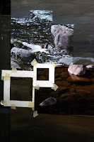 should clear things up a bit. I know there are folks out there who want to believe there is some sort of “magic” involved in the painting process (and a lot of artists who make a point to perpetuate that belief!), but there’s nothing magic about this method. It’s straight forward and almost mechanical in its execution. If you’ve got the patience, almost anyone can do this. There is some geometry involved with figuring out the initial square size on the reference photo and how it relates to the square on the painting. Just don’t ask me for the formulas. I can figure it out… I just can’t explain it!
Also, I must emphasize the need for the artist to not simply and blindly “duplicate” photographs. Once you understand how this works, it allows you to use your artistic discretion as to what will make the image “better.” In other words… what to move, tweak, remove, add, etc. Simply duplicating a photo is nothing more than an exercise in busy work!
The focus square on my reference photo is 2x2. That works out to 3.8x3.8 on my painting. I’ve made paper masks of the appropriates sizes and taped them down with drafting tape.
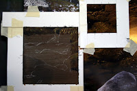
Since this pattern is fairly complex, I’ve drawn some guidelines with a white charcoal pencil.

I’ve quickly smacked in the darks, concentrating more on getting the values close without worrying too much about the exact hues. They can easily be tweaked later.
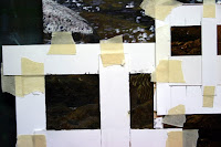
At this point, I’ve decided to break the focus squares down even more, dividing them into even quarters. Now I can concentrate on duplicating abstract shape without worrying about painting “rocks under water.”
I’m starting to refine the shapes and get the hues correct in this step.

A bit more refinement and tapping in the highlights in just the right spots. (note: In this situation, I’ve found that sunlit rocks below clear water are dominated by hues of yellow ochre and burnt sienna. There are also notes of cerulean blue that nicely balance out the other warm hues.)
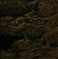
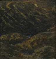
Once all 4 of the smaller quarters are finished and the mask is removed, this is the result. Still, it looks pretty abstract. In the larger context of the entire painting… it appears nearly photographic!
 should clear things up a bit. I know there are folks out there who want to believe there is some sort of “magic” involved in the painting process (and a lot of artists who make a point to perpetuate that belief!), but there’s nothing magic about this method. It’s straight forward and almost mechanical in its execution. If you’ve got the patience, almost anyone can do this. There is some geometry involved with figuring out the initial square size on the reference photo and how it relates to the square on the painting. Just don’t ask me for the formulas. I can figure it out… I just can’t explain it!
Also, I must emphasize the need for the artist to not simply and blindly “duplicate” photographs. Once you understand how this works, it allows you to use your artistic discretion as to what will make the image “better.” In other words… what to move, tweak, remove, add, etc. Simply duplicating a photo is nothing more than an exercise in busy work!

The focus square on my reference photo is 2x2. That works out to 3.8x3.8 on my painting. I’ve made paper masks of the appropriates sizes and taped them down with drafting tape.
Since this pattern is fairly complex, I’ve drawn some guidelines with a white charcoal pencil.

I’ve quickly smacked in the darks, concentrating more on getting the values close without worrying too much about the exact hues. They can easily be tweaked later.

At this point, I’ve decided to break the focus squares down even more, dividing them into even quarters. Now I can concentrate on duplicating abstract shape without worrying about painting “rocks under water.”

I’m starting to refine the shapes and get the hues correct in this step.

A bit more refinement and tapping in the highlights in just the right spots. (note: In this situation, I’ve found that sunlit rocks below clear water are dominated by hues of yellow ochre and burnt sienna. There are also notes of cerulean blue that nicely balance out the other warm hues.)

Once all 4 of the smaller quarters are finished and the mask is removed, this is the result. Still, it looks pretty abstract. In the larger context of the entire painting… it appears nearly photographic!
1 comment:
Thanks for explaining Jim - it all makes perfect sense. As I tend to be quite undisciplined and flit around all over the painting, this might just be the methodical approach I need. I look forward to seeing the finished painting.
Post a Comment